Carbon Dashboard
Check the dashboard here: https://blog-version-indu4lxlqa-ez.a.run.app/
Idea
In this blog post. I’m going to show how I made a web dashboard tracking the emissions of trucking user. It can be adjusted for other methods of tracking emissions. I got the idea from a start-up called PlanA. Which specialises in developing technology that calculates a company’s emissions. And gives them suggestions to reduce them. I also thought that it may be a good idea to continue the carbon emission API I developed. Where a user can come to one place to get their emissions.
Forecasting
The dashboard will be showing a line graph of the emissions created by the user. I think a good idea for the dashboard is to have a forecast of the emissions. To see if the user is on track. To do something like that we need to do a time series analysis, as we are tracking data over some time. They are two main routes to do a time series analysis. There is the traditional way of using statistical techniques like ARIMA, SARIMA. And the new machine learning way. Building Machine learning models to learn from the data. With model structures like LSTM and RNN.
An example of machine learning being used for forecasting is predicting the power output of renewable energy. As renewable energy is harder is dispatch on demand. Unlike fossil fuels. DeepMind was able to increase the economic value of a wind farm by 20%. By forecasting the power output over 16 days.
Developing the ML model
To first to develop any ML model. You need data. The bread and butter of a machine learning model. First, I googled around for some type of data about road freight. I did not find what I wanted. So, I went to Microsoft excel to create dummy data. With the columns of date, miles, tonnes, tonnes/miles, and CO2. The date was chosen by me. And I used to autocomplete fill out the rest of the rows. Then I produced miles and tonnes. They were randomly generated. And tonnes/miles were the miles and tonnes multiplied. And the CO2 column was calculated by multiplying the mile-tonnes column and with a carbon factor. And then dividing to one million. Division converts the CO2 grams to metric tons.

After that, I googled around to find a model that I can use for time series data. I found a TensorFlow example from google. Where they used an LSTM network. To forecast a weather time series. First used one variable from the dataset. The second used multivariate data. To forecast the graph.
While developing the model I noticed while training the model the validation loss. Will spike up later into the training session. To deal with I had to add many customisations into the model. I changed the sizes of the batches. Changed the number of epochs.
I later decided to increase the data size. The model was struggling with overfitting. And answers describing overfitting normally said it not enough data. I Increased the number of rows to 500. Compared to the 100 rows before. The model only improved marginally. Then I looked closer at the data. Then I noticed that the data had a high variance. Which may be affecting the model training. As it was struggling to find patterns. So, I adjusted the data to have a normal distribution. So, less variance can be in the dataset. I gave it to the model and had some improvement.
=NORMINV(RAND(), 350, 5)
I got this function from this YouTube video. The function creates a distribution with a random probability. Provided by RAND(). Then the mean is either the miles or tonnes depending on the column. Then 5 or another number is the standard deviation.
But the model was still struck. After a lot of training and changes. I only got the model to have a loss of around 65%. Which means it still guesses wrong most of the time.
Some images of one of the training sessions:
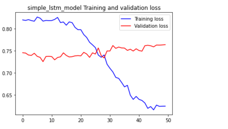

We can see here the validation data does not reduce. Or the training loss decreases slowly. Which means it still may be overfitting.
I think is because the dataset is random. The reason why I think it’s the dataset, not the model. Because the dataset has a lack of clear patterns. For example, every Friday the user drives 100 miles. Most data will have some pattern to them. But random data is random. So, it’s hard to find patterns when something is random. So, something I need to investigate more making dummy data without being too random. The distribution change to the data was a good start.
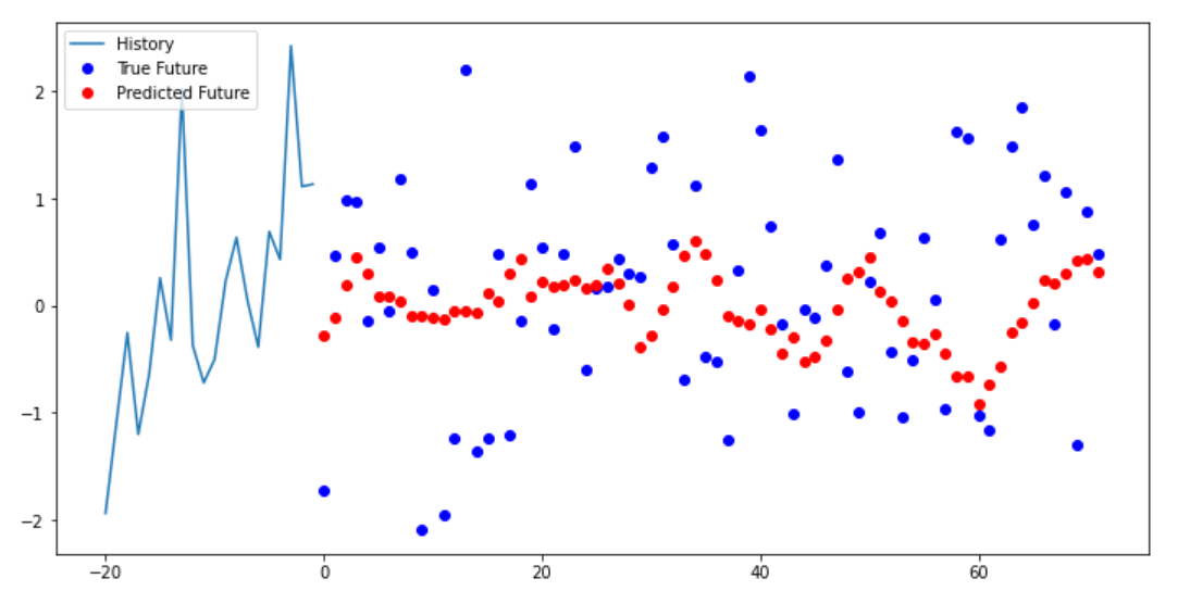
We can see below the multi-step model trying to predict the next data points. The model we can see can get some type of pattern. But the data itself is very random. As the data points are all over the place. Causing the model to get its predictions wrong.
Developing the dashboard
I did not want to make a dashboard from starch. As that will take too long. And it’s not my area of expertise. I found a template I can use called Flask dashboard argon. By Appseed and Creative Tim. Provides a clean UI with bootstrap. Provide SQL database and authentication

Figure 1 https://appseed.us/admin-dashboards/flask-boilerplate-dashboard-argon
First, I made a few changes with the top stats to get a feel of the code. Then moved to the main focus which was changing the charts to display custom data. From the dataset showing the emissions of the user. I first tried doing so with the “data-toggle” feature. An attribute from the template. Which changed the data of the chart. After using it I noticed a few issues. That when I added more data than the x-axis labels showed. Then the chart will continue off-screen. The second and most important that the scale of the CO2 emissions was very small compared to the sales numbers. So, the CO2 numbers did not show.
So, I had to find a way to change the numbers with the data-toggle. To do that I had to go into the code of the dashboard itself. And edit the chart.js properties. I was able to get better results, but the CO2 numbers were not showing up correctly. And each time when I hover over the chart. It reverts to the default state. I was able to fix the reversion glitch by updating the JavaScript min files. By compressing JavaScript where I was doing the edits. And replacing the default min file with mine.
Editing chart.js
I used the dataset that I produced in excel. I copied the columns of CO2 and date separately. As the chart only took a small amount of numbers, before the chart they went off-screen. Also, I needed to adjust the settings of the chart. To remove the dollars signs that signify currency. Also, the “k” that represents a thousand dollars. While using the data-update attribute. You could change the data-suffix and data-prefix attribute. But didn’t work when hovering the chart. The data-prefix and data-suffix should change the format of the y Axis. But that did not happen. So, I had to fix that.
To the Y axis I found need to edit a function in setting the chart. Callback has a function that added extra characters to the value.
ticks: {
                  callback: function(value) {
                    if (!(value % 10)) {
                      return '$' + value + 'k';
I changed it into this:
ticks: {
              callback: function(value) {
                if (value) {
                  // return '$' + value + 'k';
                  return value + ' Tons of CO2'
                }
The if (!(value % 10)) returned a value did not have a reminder of 10. This made sure the Y-Axis went up in 10s. Then the value with Dollar signs is returned. This made the Y-Axis. I edited it so all values can be returned and added ‘Tons of Co2’ as a suffix.
To fix the hovering glitch. I had to change the callbacks of tooltips:
tooltips: {
    callbacks: {
    label: function(item, data) {
    var label = data.datasets[item.datasetIndex].label || '';
    var yLabel = item.yLabel;
    var content = '';

    if (data.datasets.length > 1) {
    content += '<span class="popover-body-label mr-auto">' + label + '</span>';
    }

    content += '<span class="popover-body-value">$' + yLabel + 'k</span>';
    return content;
    }
After:
tooltips: {
          callbacks: {
            label: function(item, data) {
              var label = data.datasets[item.datasetIndex].label || '';
              var yLabel = item.yLabel;
              // console.log(yLabel);
              // console.log(label);
              var content = '';

              if (data.datasets.length > 1) {
                content += '<span class="popover-body-label mr-auto">' + label + '</span>';
              }

              content += '<span class="popover-body-value">' + yLabel + ' Tons of CO2</span>';
              // console.log(content);
              return content;
            }
I mainly edited the span to get rid of the dollar sign and replacing with ‘Tons of CO2
Then the chart gets the labels and data.
data: {
      data: {
        labels:  ['2019-02-05', '2019-02-05', '2019-02-06', '2019-02-06', '2019-02-07', '2019-02-07',  '2019-02-08', '2019-02-08'],
        datasets: [{
          label: 'Performance',
          data: [0.74, 0.86, 0.70, 1.03, 1.28, 1.17, 1.00 , 0.56]
        }]
      }
Adding the forecast chart
After that, I needed to make a chart a forecast. They used the data from the excel dataset. Rather from the ML model. Like I mentioned before that chart only allows for a few data points. Before the chart looks incomplete because of the data points loading off-screen. So, I only added two extra data points.
The chart has a bootstrap button that toggles different charts. I repurposed them for the forecast and week chart. I created a separate forecast class. So, JavaScript can call on that element. Editing the HTML so the button toggles to the forecast chart. First, it did not work correctly as the chart appeared just below the normal chart. Also, behind the page visits table. So, it was not visible as well.
I needed to find a way to hide the chart. And only show if the user clicked the forecast button. To do that I needed to add some extra JavaScript. First, I added a jQuery function that when forecast button was clicked then, the weekly chart will be hidden. But when I clicked the week button again. The chart did not toggle back. Therefore, I had the change the JQuery code again. This time the chart forecast started as hidden. After it was initialised. Then a jQuery function shows the forecast chart. And hides the sales chart. It does vice versa with the sales chart.
$('#chart-forecast').hide()


  $('#forecast_tab').on('click',function(){
      $('#chart-forecast').show()
      $('#chart-sales').hide()

   });

   $('#sales_tab').on('click',function(){
       $('#chart-sales').show()
       $('#chart-forecast').hide()

    });
Now the chart worked correctly:

Changing top stats
After that, I did minor edits to the top stats on the website. This was simple compared to the editing of the charts. As I just had to edit the text.
Then I changed the table below the chart. The content was showing page traffic to the website. I changed to show carbon offset programmes that the user can buy.
The edits I made was changing the text. Deleting columns. And adding buy buttons to the rows.
The names and the prices of the carbon offset programmes. I got from the website Gold Standard. A popular distributor of carbon offset projects. I replaced the default text in the table with information from the site. Then I replaced the last column with a button asking the user to buy the carbon offset.
Formatting table
After that, I deleted the section of the website that I did not need. The website had a social media section tracking traffic from social media. I deleted that section. Leading to more space on the website. After the social media section got deleted the table seemed out of place. Because the placement assumed that the social media section was there. To centre the table to the centre of the page I found out I needed to add row justify-content-center to the div class row that contains the table. After I added that the table was centred to the page.
Default page:

My page:

Deployment
To have an interactive example that I can show you. I need to deploy the website on a server. I decided to use google cloud. As I already have an account. Flask Dashboard Argon comes with a docker file. Which I can use to deploy.
I will be deploying the website using google cloud’s cloud run service. That allows you to publish containerised apps. Using the cloud SDK, I ran this command to start the building of the container.
gcloud builds submit --tag gcr.io/PROJECT-ID/helloworld
Then we can see the process below:

Then I got this error and other similar ones:
denied: Token exchange failed for project 'carbon-dashboard-kdjfka'. Caller does not have permission 'storage.buckets.create'. To configure permissions, follow instructions at: https://cloud.google.com/container-registry/docs/access-control
To fix this issue I gave myself extra permissions to use the cloud storage resources.
Afterwards I got this error:
Container failed to start. Failed to start and then listen on the port defined by the PORT environment variable
But I was able to fix the issues by changing the container port. Which was set to 8080 by default. So changed it to 5050. Which is the container port in the docker file.
I forgot to turn off the website login. As example website have a person sign up for account is not useful. To fix that I had to into the flask routes files.
@blueprint.route('/index')
# @login_required
def index():

    # if not current_user.is_authenticated:
    #     return redirect(url_for('base_blueprint.login'))

    return render_template('index.html')


@blueprint.route('/')
def route_default():
    # return redirect(url_for('base_blueprint.login'))
    return render_template('index.html')
I disabled the redirection to the login page. So, the user can go straight to the index page.
Then I made a new google cloud build. So, it can be deployed.
You can check the deployment here: https://blog-version-indu4lxlqa-ez.a.run.app/